St. Paul Classic
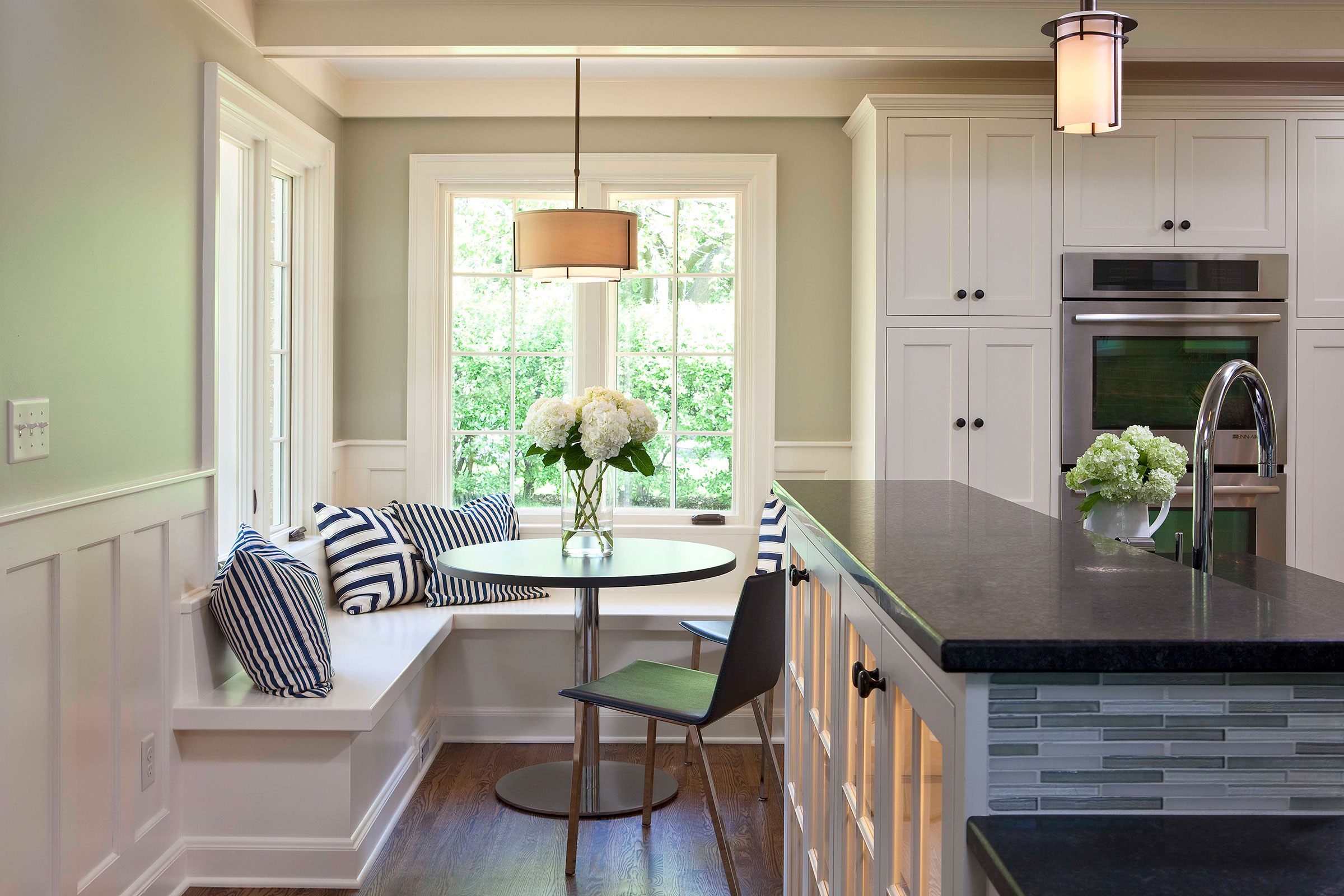
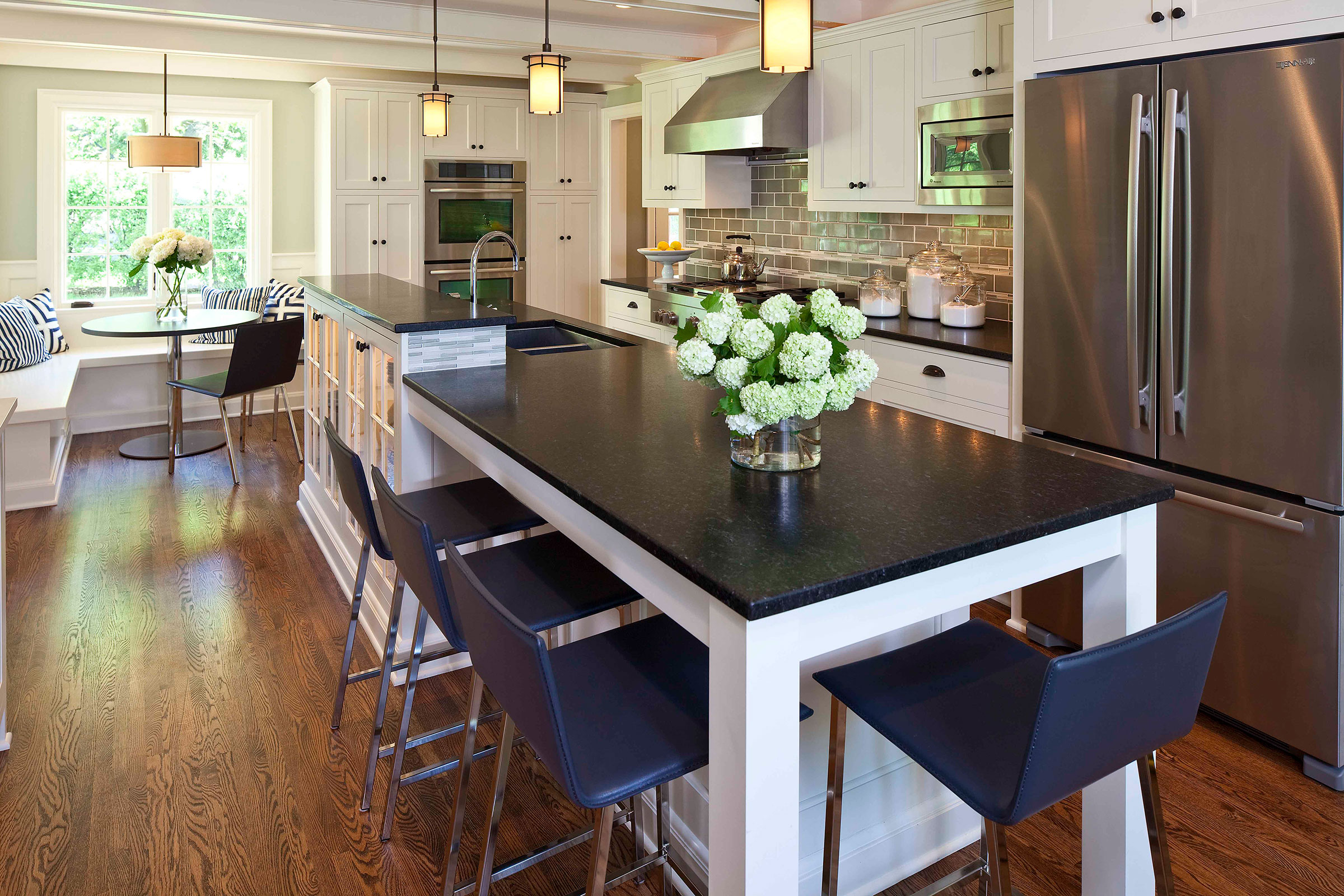
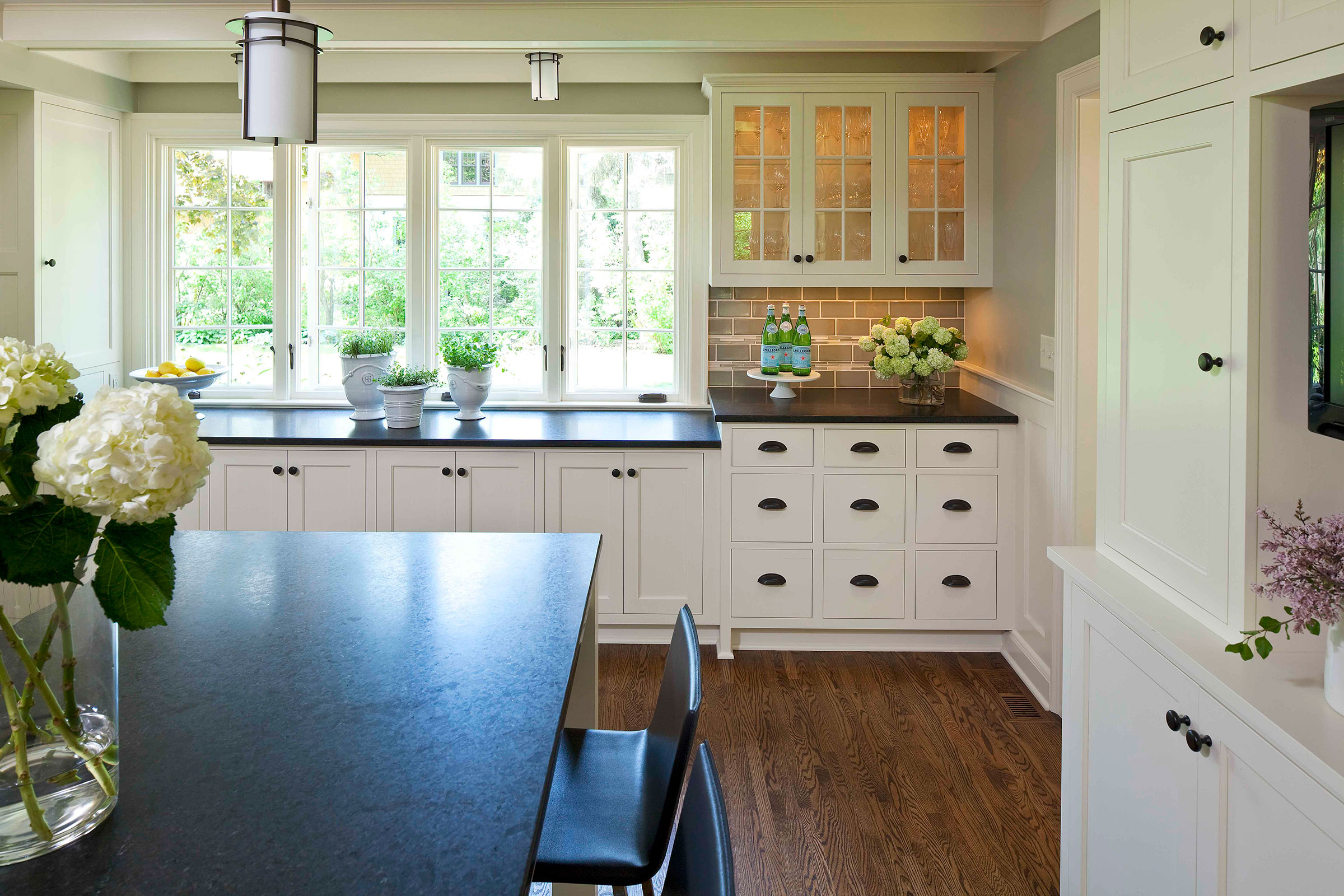
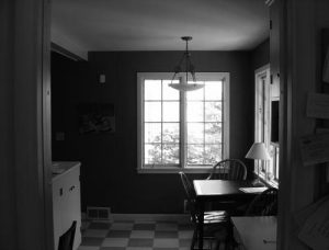
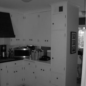
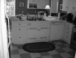
This St. Paul home was in good shape except for the dark, dated and poorly built kitchen. The new design opens up the space and allows more daylight in. The layout is more efficient with more cabinetry, a separate wall oven, and new island seating, all within the old kitchen footprint. New wainscoting integrates the trim and cabinetry. New oak floors and granite counters contrast with the cabinets. Subway and glass accent tile instill subtle character.
Contractor: Ben Quie & Sons
Photographer: Troy Thies

